User test tui.nl: How digitally accessible is booking your holiday?
The May holidays are approaching, which is the perfect time to think about the accessibility of online holiday bookings. After an earlier user test on booking.com with Myrna, we are now focusing on tui.nl, especially in view of the requirements of the European Accessibility Act that comes into force in June 2025.
Meet Milot
Two years ago, I met Milot, a 26-year-old from Rotterdam. Milot lives with congenital stationary night blindness (CSNB) type 2, a condition that not only affects her night vision, but is also associated with light hypersensitivity and problems perceiving colours.
User test
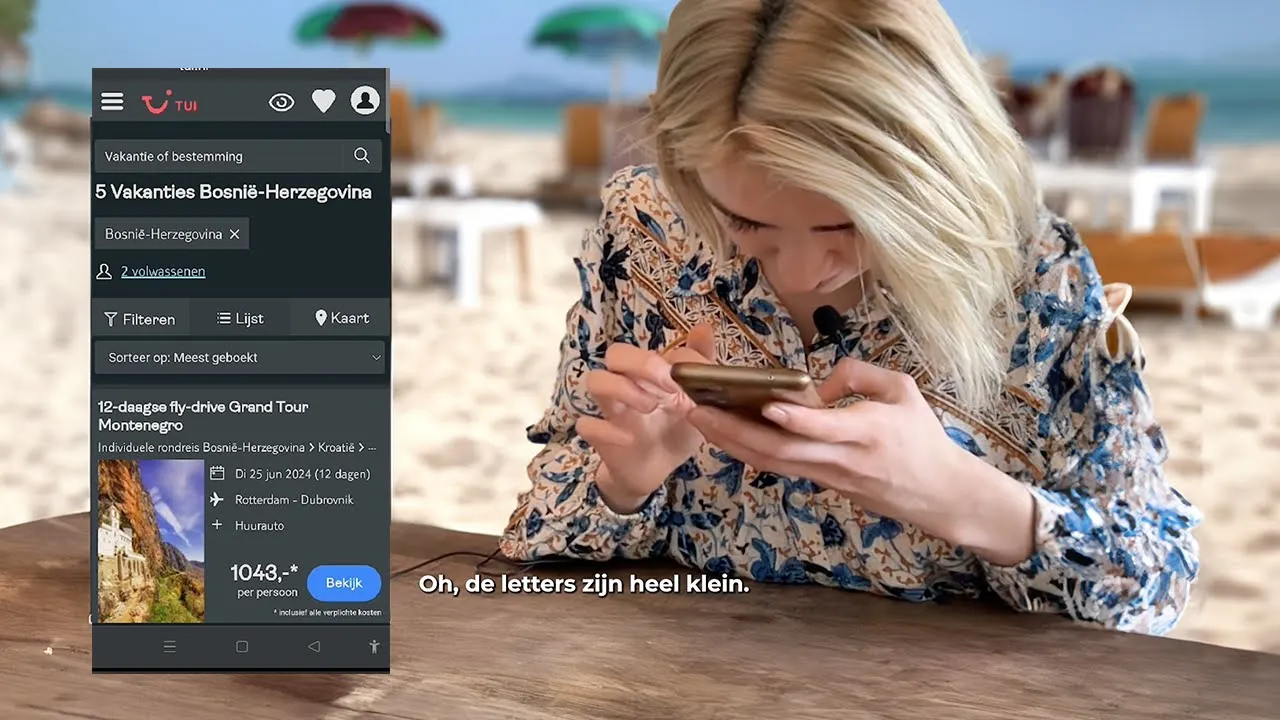
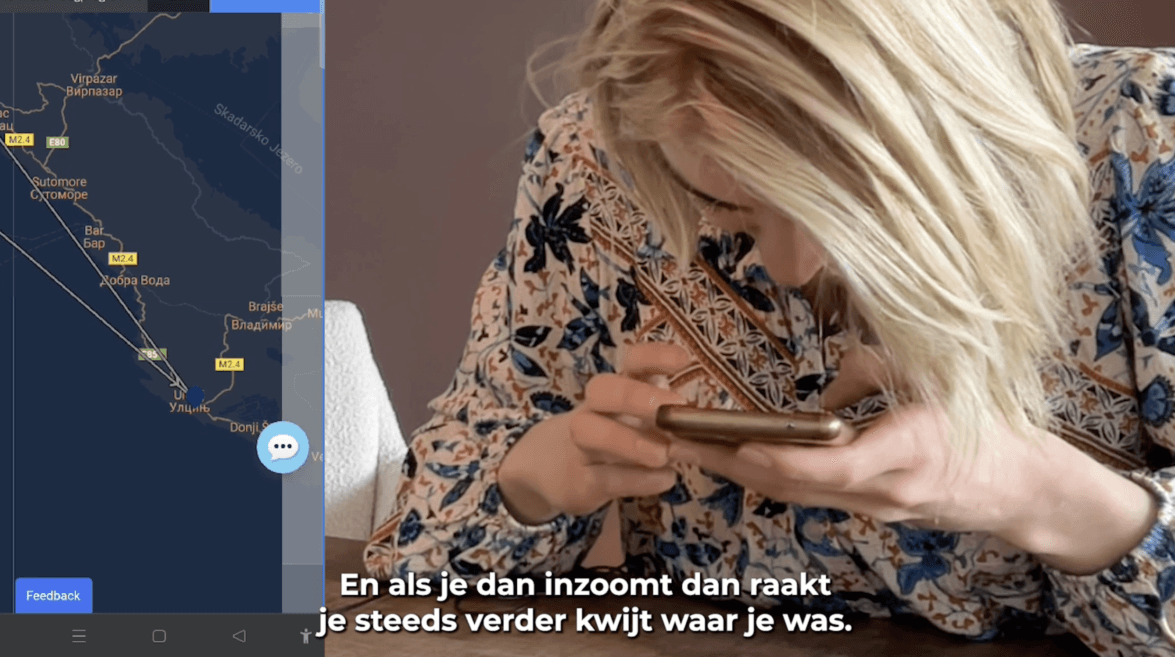
In our latest video, Milot tries to book a holiday to Bosnia through the tui.nl website. She encounters several challenges, including insufficient colour contrast and text sizes that are too small. These problems make the website difficult to navigate for someone with a visual impairment.
I don't even know what I said yes to
Milot
Kleurcontrast
Good colour contrast is indispensable for people like Milot. In our recent video, you can see how she experiences significant difficulties due to insufficient colour contrast. Here are some effective ways to make your digital platforms more accessible to people with visual impairments:
High contrast: make sure text and other crucial elements have high contrast. This makes them more visible to people who are visually impaired or colour-blind.
Clarify links: make sure links stand out more than just by colour; also use other visual means such as underlining to distinguish them.
Customise graphs and diagrams: Use different shapes and colours in your graphs and diagrams, and offer alternatives such as tables, so that all users can easily understand the information
Find out how to measure colour contrast yourself using a colour contrast analyser
Zoom and text size
For users like Milot, who face the challenges of small fonts, the ability to adjust the text size or zoom in on a page is invaluable. This allows them to read the text clearly, significantly improving their overall user experience on your website.
Have you ever wondered what happens to your website if you enlarge the font by 200% or zoom in on the page? Does the text still remain legible?
Here are some tips to ensure your website remains optimally readable even in these conditions:
Readability: Make sure your text always remains crisp and clear, without breaking or awkwardly overlapping, even when users zoom in.
Navigation: all navigational elements should remain easily accessible without horizontal scrolling, even when zoomed in.
Interactive elements: links, buttons and forms should remain functional no matter how much they are zoomed in. Make sure these elements are large and clear enough to be easy to use.
European Accessibility Act
I hope this video gives you a better understanding of the situation Milot experiences when she tries to book a trip independently. Compliance with the European Accessibility Act is not only a requirement for travel companies. It also applies to all other commercial websites and apps. However, we find that many organisations lack internal knowledge on the subject. A good starting point is to review the steps we set up after our previous user test. You can find the roadmap in our previous blog.

I am happy to help you get started with digital accessibility.


